Critical Decisions, Quality Leadership Experiences
Transforming Decision-Making Through Deliberate Design
Logo Creation ~ Business Cards ~ Brand Style Guide ~ Website Design
Meeting the Vision
When the founders of Critical Decisions approached me, they came with a clear mission: create a visual identity for their bespoke leadership experiences that would challenge and inspire global leaders seeking reinvention and enhanced decision-making strategies. Their concept required a brand as sophisticated and thought-provoking as the experiences they curate.
As a partnership focused on transformative leadership journeys, they needed a brand that could communicate authority while remaining visually distinctive in a crowded market. My challenge was to translate this balance into a cohesive visual identity that would carry from logo to business cards to their soft launch website.
The Evolution Process
We began with extensive exploration sessions to understand the essence of what makes their leadership experiences unique. The founder came to me with a general conceptual idea for the logo symbol—a starting point that represented their core philosophy about decision pathways. Together, we workshopped several variations, refining the elements until we found the perfect expression that captured both their concept and market positioning.
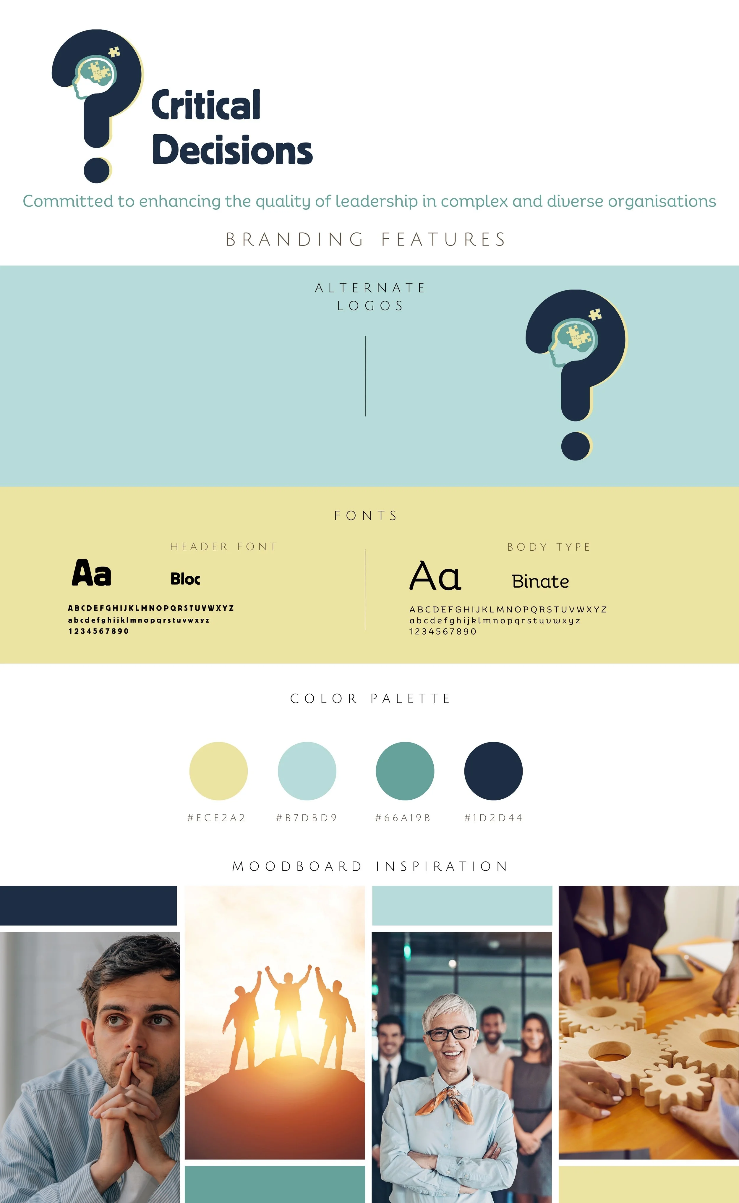
Our initial creative direction featured a vibrant magenta and orange palette—energetic and bold, reflecting the transformative nature of their work.
However, design is an iterative process, and our strategy review revealed something important: while the energy was right, the sophistication needed elevation. Global leaders looking for reinvention require an experience that feels premium yet progressive. This insight led us to pivot toward a more refined colour palette while maintaining visual impact.
Typography as Strategy
I particularly enjoyed working with the typography for Critical Decisions, creating a dynamic tension between bold, weighted fonts and contemporary, professional typefaces. This intentional contrast wasn't merely aesthetic—it visually represented the different approaches in their leadership experiences, where traditional frameworks meet innovative methodologies.
The interplay between these typographic styles creates a visual metaphor for the very decision-making processes they teach: knowing when to be bold versus when to employ nuance and subtlety. This attention to typographic detail carries significant meaning throughout all branded materials.
The Complete Identity
The finished visual wardrobe includes:
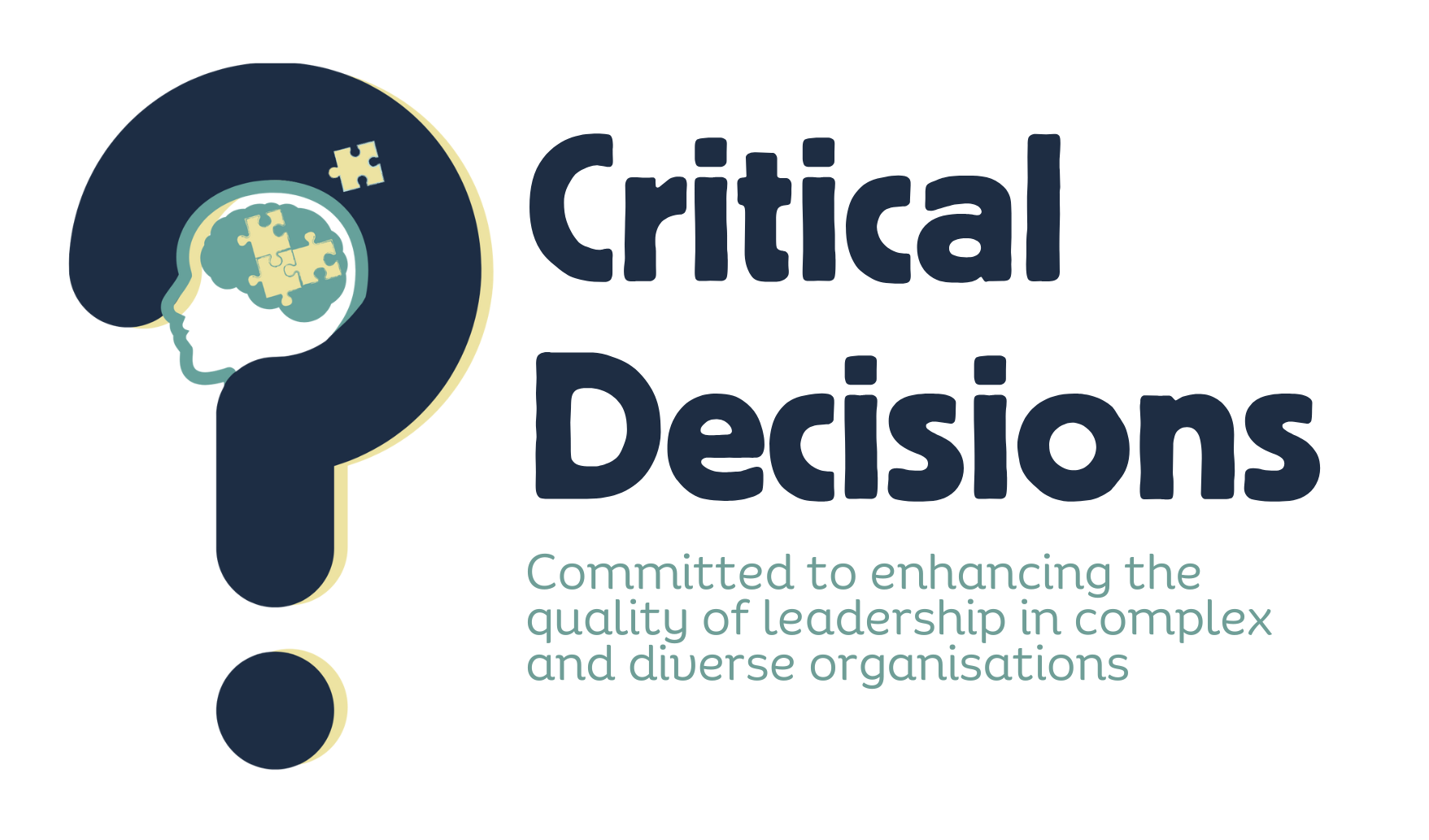
A distinctive logo that evolved from the founder's original concept into a refined symbol communicating puzzle-solving and piecing it together
Elegant business cards that make lasting first impressions
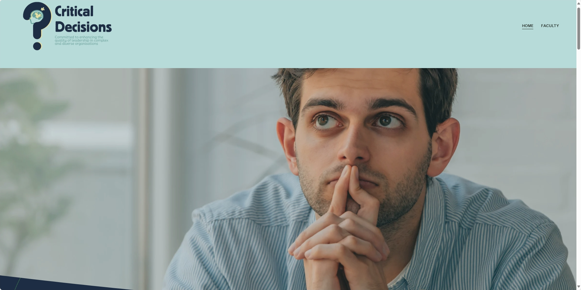
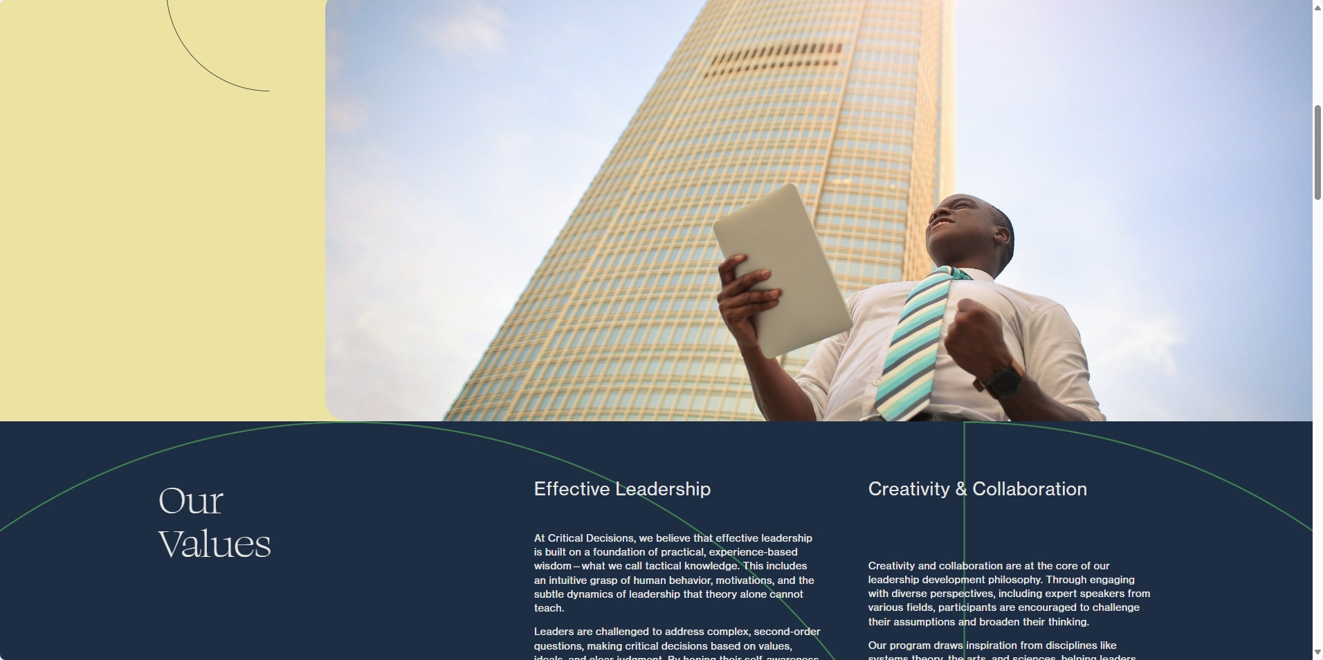
A strategically designed website with purposeful typography that guides the user journey
Visual enhancements and emphasised points throughout the site that highlight key service qualities
A structured layout and straightforward user experience that guides visitors toward the most critical decision—making contact
The full website utilises these visual emphasis points strategically, drawing attention to their unique methodology and competitive advantages. The user experience was designed with conversion in mind, creating clear pathways that naturally lead potential clients toward connection.
Ready for Launch
With their soft launch approaching, Critical Decisions now has a complete visual identity that accurately reflects the caliber of their offerings. The entire process—from workshopping the founder's initial logo concept through strategic refinement to final execution—demonstrates how thoughtful design decisions can elevate a brand's positioning.
By designing every aspect myself, I've ensured a seamless visual experience that will support Critical Decisions as they establish themselves in the competitive leadership development market.